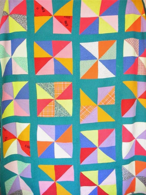
Noémi Raymond,
Striped Fields for Schumachers
1948
Noémi Purnessin (1889-1980) and Antonin Raymond about the
time of their marriage in 1914; from Crafting a Modern World:
The Architecture and Design of Antonin and Noémi Raymond
Noémi Purnessin was born in Cannes, France and came with her family to the United States when she was about 12 years old. After attending Columbia Teachers College, majoring in fine art and philosophy, she traveled to Europe. As World War I threatened she returned to America, meeting Czech-born Antonin Raymond on the ship.
The two became design partners, moving from painting and graphics to architecture. In 1916 the couple and their son accompanied architect Frank Lloyd Wright to Japan, which became a home they alternated with New Hope, Pennsylvania.
A modern Japanese interior by the Raymonds. Antonin usually
got the credit, but Noémi was a partner.
Their architectural work, influenced by their two-year work with Wright on the Imperial Hotel in Tokyo, and their enthusiasm for the Japanese aesthetic, combined interior and exterior into a unified living space.
Noémi Raymond,
Speckles for Knoll
Noémi Raymond,
Mosaic for Knoll
1950
Noemi Raymond's textiles for Knoll and Schumachers show
the influence of Japanese design.
Squares, Blobs and Speckles for
Cyrus Clark Co., about 1940
Raymond donated several pieces of printed fabric to the Museum of Modern Art. Click here:
http://www.moma.org/collection/browse_results.php?criteria=O%3AAD%3AE%3A36881&page_number=7&template_id=1&sort_order=1
Noemi Raymond's Circles is a featured piece at the Museum of Modern Art's current exhibit Designing Modern Women 1890-1990.
See a preview of
Crafting a Modern World: The Architecture and Design of Antonin and Noémi Raymond by Kurt Helfrich &William Whitaker at Google Books:
http://books.google.com/books?id=SyzU6DG0TloC&printsec=frontcover&dq=noemi+raymond+crafting+modern&hl=en&sa=X&ei=8M-BU4eJAce-sQTgqIAo&ved=0CC0Q6AEwAA#v=onepage&q=noemi%20raymond%20crafting%20modern&f=false


JnEw~~60_57.jpg)


.JPG)
