William Adolphe Bouguereau
A Little Coaxing, 1890
The epitome of a romantic painter, Bouguereau told a story that the viewer can interpret: Perhaps: two sisters, one orange. The narrative is cute; the girls are sweet; the picture evokes many sentiments.
Sentimentalism is the use of art to evoke those kinds of emotions: cute, sweet, nostalgic, protective, heartwarming, etc. The modernists often defined themselves as anti-Bouguereau.
Édouard Manet
Le déjeuner sur l'herbe ("The Luncheon on the Grass")
1867
Manet's painting is considered one of the first modern paintings, not so much in its abstraction or color but in its opposition to a narrative or sentimentalism. What is going on here? It's hard to interpret. Naked women, a picnic? It's unsettling and meant to be.
There is no story. It is Art for the Sake of Art--- an important modern slogan. Stop looking for a narrative or an emotion.
Fernand Leger
Le déjeuner, 1921
Again we have naked women eating a meal. What's it mean? Modernists kept pushing the non-narrative idea.
Two paintings by Helen Frankenthaler
Until the standard became color and shape for the sake of color and shape.
Modernists believed that true art should reject art's traditional obligation to uplift patriotic spirits, inspire religious faith and glorify the government.
"Art should be independent of all claptrap —should stand alone ...and
appeal to the artistic sense of eye or ear, without confounding this with
emotions entirely foreign to it, as devotion, pity, love, patriotism and the
like."
James McNeill Whistler
Of course nobody ever went broke overestimating the audience's need for sentiment.
Margaret Keane painted many emotionally-manipulative paintings in
the 1960s that were attributed to her husband Walter.
So what is the opposite of sentimentalism?
Rationalism?
Homage to the Square: La Tehuana by Josef Albers, 1951
Shocking?
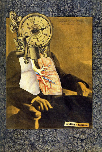
Raoul Hausmann
Self-Portrait, 1920
Another modernist slogan was "Épater
la bourgeoisie." (Shock the middle classes.)
[Pronounced ay‐pat‐ay luh boor‐zhwah-zee.]
LHOOQ by Marcel Duchamp, 1919
Or is Dada the opposite of sentimentalism? Dada is
a meaningless word for art without meaning.
Art for the sake of art.
And here we have one of the great conflicts in modernism.
The majority of the audience likes to read a sentimental story into art. A minority, the avant-garde, considers sentimentality trite, manipulative and just uncool.


.jpg)