Thursday, June 27, 2013

Minimalism in a Maximal Culture

Early 20th century quilt

Late 19th-century parlor

One of the contradictions in quilt history is that women who decorated their homes and children to visual excess also made quilts that are exemplars of minimalism.
(Do notice the hooked rug on the floor in the photo. It's has an Oddfellows theme with the heart in hand and the letters FLT---but I digress.) 


Block

Quilt from about 1910

Quilt from ?

Quilt from about 1890
Of course, there are plenty of surviving examples of late Victorian romantic clutter. 

But how two such different styles coexisted is an interesting puzzle.

Above and Below about 1900


Here we have a style mixture, a good example of the paradox---
The center of wools: an excellent example of functionality.
The print border: an excellent example of ornament for its own sake.

Monday, June 24, 2013

Modern Print Monday: Vernon MacFarlane

Audrey Hepburn at El Morocco in 1951

Fake zebra stripes seem so obvious we can imagine Adam & Eve leaving the Garden of Eden clad in velveteen animal prints, but there had to be a designer who was the first to say: "Faux Zebra! There's an idea!"
Some credit Elsie de Wolfe in the 1920s and others Vernon MacFarlane, the interior designer who did all the New York nightclubs before and after Prohibition's repeal in 1933.


See the inside of this El Morocco matchbook at the New York Historical Society here:

MacFarlane certainly made faux zebra synonymous with exotic sophistication. His banquettes at El Morocco were upholstered in stripes printed in the obviously fake color scheme of navy blue on white. The story is that the speakeasy was decorated with a minimal hand for reasons of budget and the sloppiness of the clientele. A desert oasis in Northern Africa was chosen as the theme.

Clark Gable and Slim Keith 

Celebrities photographed in the booths were instantly identifiable as El Morocco patrons. MacFarlane added fake palm trees and a desert sky of twinkling lights, two other illusions that became classics.

The palm trees seem to have been white.
The leaves were originally of cellophane.

Biographical details about MacFarlane are slim---he wasn't. He was either an Australian or a New Zealander---it all looked the same from New York. His interiors in the 1930s defined celebrity.

Merle Oberon (left) and friends
under a fake palm tree

Thursday, June 20, 2013

Modern Needlework: Arts & Crafts Embroidery

Arts and Crafts Embroidery on linen
See a free pattern for the center pillow design below.

Jessie Newbery (1864-1948) was  head of the embroidery department at the Glasgow School of Art in Scotland. Not many art schools consider an embroidery department a necessity but the great thing about Glasgow a century ago was that traditional women's arts were considered on a par with those traditionally done by men. Newbery and the Glasgow School created a new style of embroidery.


Cushion Cover by Jessie Newbery in The Studio 1901

See a different version of this embroidery at the Glasgow Museums site:

 Newbery's designs were published in the influential English magazine The Studio.


Thanks to the "New Embroidery" early modern interiors required many hand-embroidered sofa pillows.
The one above seems to be bound with a contrasting cord.

The stylized floral pillow on the right has a fringed finish.


Glasgow School Design characteristics included filled embroidery on linen grounds with stylized florals of elongated and sinuous shapes. Florals were defined by shape with a minimum of naturalistic shading.  Mottoes were stitched in distinctive arts and crafts type fonts. The original for this embroidery had sweet peas framing the motto. I simplified it by substituting stylized roses, Glasgow Roses.

For a pattern: Click on the picture directly above and copy it to a JPG or a Word file. Then print it out about 11" x 8-1/2".
Or click here for a PDF from Workspaces at Acrobat.

The Glasgow embroiderers used a variety of stitches, but the most common was called the Kensington stitch. See a tutorial here:

And view another of Newbery's cushion covers at the Victoria & Albert Museum

Monday, June 17, 2013

Modern Print Monday: Jacqueline Groag

Unnamed by Jacqueline Groag, 1952

Jacqueline Groag
1903-1986

This design of rounded squares printed on rayon for the English firm David Whitehead, Ltd., is now called "Pebbles." Wind- and water-worn stones may have been her inspiration. 

But others see technology...
Above a 1948 television.


The rounded square is Groag's signature print,
on the cover of two books about her.

She's also the subject of a show up right now at the Denver Art Museum.
Pattern Play: The Contemporary Designs of Jacqueline Groag will close on September 22, 2013.


See more about her at the Worn Through blog:

Born Hilde Pilke in Prague, she studied under Josef Hoffmann at the Wiener Werkstatte in Austria in the late 1920s. She designed for that workshop under her married name Hilde Blumberger. In 1937 she moved to Paris and designed prints for Schiaparelli and Lanvin. In 1939 she and her second husband, architect Jacques Groag, moved to London to escape Hitler's Europe.


She was one of the post-War British designers
who defined "Contemporary Prints."


The rounded square and rectangle mean mid-century modern to us.
Above, vinyl decals for today's modern decor.

Did Groag invent the rounded square?

No, it was in the air.
Above sculpture by Kenneth Armitage from the early 1950s.

Sonia Delaunay 1929

And you can always go back to Sonia Delaunay and see that she thought of it too 20 years earlier. (She seems to have thought of everything.)

Mechtildes By Frederick Etchells
1913
As did the Omega Workshop designers in the early teens.

But the rounded square became THE shape in the 1950s,
found in the heavy furnishing fabrics we call barkcloth...

And trickling down to feedsack prints.

In their 1960 catalog Montgomery Ward's described desirable design:

"Modern, rounded square shapes in pure white sparked by the glow of warm color..."


Thursday, June 13, 2013

Principles of Modernism: Minimalism

Quilt top from the 1970s
Minimalism is a term that describes a composition with few elements.

Sonia Delaunay
JoJo 1969

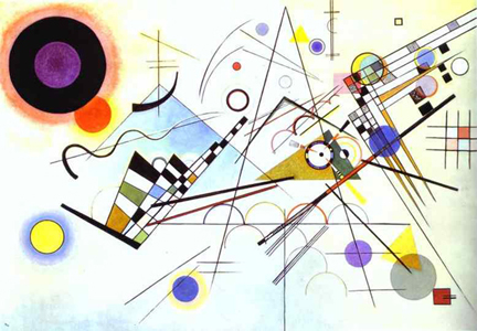
Wassily Kandinsky 
Composition VIII 1923

Modernists pushing abstraction tried to eliminate the non-essentials. Some theorized that the essentials involved only basic color and basic shapes. Basic color included the primaries: red, blue and yellow. Basic shapes were circles, squares, triangles and rectangles.

Study for an exhibit poster about the Bauhaus
by Herbert Bayer

Detail of a Mondrian painting

Piet Mondrian's work is classic minimalism.

Trylon and Perisphere from the 1939 New York World's Fair
by architects Wallace Harrison and J. Andre Fouilhoux.
Two primary colors, two primary shapes.

Quilts often do minimalism as well or better than any artist struggling to get rid of the non-essentials.


Circles & Squares


Triangles


See a classic triangle quilt by Annie Pettway here:


Textile prints were also influenced by minimalism.
Sophia Loren

The  black and white polka dot is the classic minimalist print---
no color, just circles.
Designers reduced the figure to the basics.

From the Wiener Werkstatte
(Viennese Workshop)
Metropolitan Museum of Art
See more of their impressive WW collection by clicking here:

Feedsack print about 1950

More minimalism in 20th-century quilts:


Silkscreen paper print by Laszlo Maholy-Nagy

Read more about Minimalism here at the Museum of Modern Art's webpage

And see a  page of Gee's Bend quilts, masterpieces of minimalism, at Auburn University's site:

Furniture designed by Norman Bel Geddes in 1933.

Variation with squares instead of circles.