Thursday, August 29, 2013

Scale and Proportion

Big Tree Crib Quilt
by Ernest Haight
Collection of the International Quilt Study Center & Museum.

I remember how impressed I was when I first saw this quilt by Ernest Haight in the 1980s. Three block sizes: an exercise in relative scale or proportion.

St. Thomas Spinning Fish by Doreen Speckmann
 Doreen Speckmann did similar experiments in scale.

New York quilt top
late 19th century

It's not a new idea to change the relative scale.

In fact it's an old idea
with medallion quilts popular before 1865

Many mid-19th-century samplers 
are built around larger blocks.
But they certainly don't look modern.


In fact changing the scale is a difficult thing to do
because the small parts can look like visual clutter.


Or the large parts can loom like a wall cloud on the Kansas horizon.


There's a lot of potential for visual disaster,

Dream Catcher by Kathy Doughty

Which makes you appreciate successful experiments in changing scale like these contemporary quilts

Princess Feathers by Kim McLean

Dustin Cecil
See his Flickr photostream here:

Leek by Linda Frost
Here's Linda's blog:


Monday, August 26, 2013

Modern Print Monday: Raymond Loewy or...

Skylark Formica
1950
Formica later changed the name to Boomerang

Raymond Loewy
(1893-1986)

The laminate countertop pattern came on the market in the 1950s and some credit Raymond Loewy, an industrial designer best known for his Studebaker.

1947 Studebaker ad
in pastels

But there is dissension in design history.
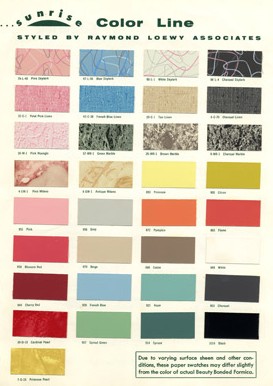
Below we have the 1953 Sunrise Color Line
featuring the Skylark at the top in pink, blue, white and charcoal gray
"styled by Raymond Loewy"


Loewy seems to have chosen a new palette and perhaps tweaked a design 
 also credited to Brooks Stevens Associates. Stevens designed Kaiser automobiles.

Brooks Stevens (1911-1995)
The shape, an abstract bird?, an amoeba? became a design icon.

Barkcloth mid '50s

See another Formica design by Brooks Stevens Associates at the Milwaukee Art Museum site:


Pink Skylark. 1954


Thursday, August 22, 2013

Scale in Vintage Quilts

A change in scale makes a quilt look quite modern,
as in this early 20th-century four-block quilt.

Four Blocks have a lot of modern appeal.  The relative size of the blocks to the composition looks quite fresh.


Here's another out-of-scale quilt
with wonderful effect. A crazy quilt from
about 1930 in the collection of Jan Masenthin.

The bright colors, the solid fabrics (cotton sateen)
make it look modern but so does the relative scale of the pieces
to the whole composition.
Many crazy quilts are full of small patterned pieces,
far more romantic than modern.

Neckties
from the Kentucky Museum collection

Potted Strawberries?
End of the 19th century?


It must be the contrast between fussy and plain that makes
this mid-20th-century quilt look modern in scale.

Here it's the contrast in image to the scale of the block,
to say nothing of the high-contrast plain fabrics.

This mid-19th century applique
 has an impressive scale, possibly again the size of the image
filling out the block, but also the unusual abstraction..

This quilt was shown at the Bush House Museum in Oregon.

Those giant tulip-shaped florals
can make for perfect compositions.
This one was the cover quilt on the Georgia Quilt Project book.


Sometimes the scale is only visible with
a figure in the photo to show how big it actually is.


There's just something about a lot of solid color
that looks big.
Ruby McKim's Pansy pattern
from about 1930.

Here's one from eBay recently.
Someone following her own muse?

Monday, August 19, 2013

Modern Print Monday:Phyllis Barron & Dorothy Larcher

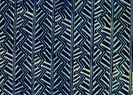
Block-printed indigo by Barron & Larcher
Mid 1920s
London

Phyllis Barron and Dorothy Larcher ran a London textile printing workshop in the 1920s and moved the workshop to Gloucestershire in the '30s.. Coco Chanel and other couturiers used their traditional yet updated fabrics in trend-setting clothes.

Phyllis Barron (1890-1964) in Vogue, 1926

Enid Marx began hand printing textiles as an assistant in their workshop. See a post on her:

See an essay by Meg Andrews on Barron & Larcher.

The Victoria and Albert Museum has many of their block-printed textiles.

With the majority of them in the Crafts Study Centre


Thursday, August 15, 2013

Modern Pattern for a Quilt: Posey Quilt


The Posey Quilt
or 
Posies Round the Square

I've been looking for the origins of this appliqued floral,
which fits so nicely into a definition of modern.
When's the earliest you see the design?


What Mary Engelbreit might call a Fried Egg Flower.

Florence LaGanke Harris, designing for her Nancy Page
quilt column, showed this ditsy flower with a ditsy print
in her 1930 syndicated Alphabet Quilt pattern.

Here's a quilt from my collection,
which is from about 1930.

The Posey Quilt

I'd guess it was made from an Eveline Foland pattern
that appeared in the Kansas City Star on June 8, 1929.
Or from a nearly identical pattern published in
Needlecraft Magazine
July, 1934.

Did Eveline recycle her Posey Quilt anonymously in 1934?


Posies Round the Square
from Needlecraft


The blocks are placed on point in both patterns and in my quilt.

#2526
or
#2525
Because it's partially pieced, the block and several related
designs are in my BlockBase program for PC's.


I imported the patterns into EQ7.


Foland was a little vague about the leaves in her sketch
but her pattern shows a simple pointed oval.


Here's the layout from the Needlecraft pattern, which shows the whole quilt.


I imported BlockBase #2525 into EQ7 and then set up a diagonal grid of 12" finished blocks,
alternating with 25 plain blocks cut to 12-1/2" square.
36 blocks set like this =about 102" square
If you look at both published patterns there is no real border.The vine is appliqued right over the edge of the blocks.

If you don't have BlockBase:
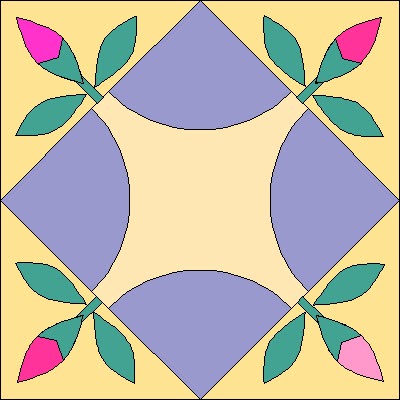
Here's a pattern for a 12" finished block

Cutting a 12" Block
A - Cut 2 squares 6-7/8". Cut each in half with a diagonal cut.
You need 4 triangles.

B and C - Use the templates.
E-G for Applique. Use the templates.. Applique the poseys to piece A before piecing the block.
You can print out the templates by clicking on the two pictures below and saving them to a JPG or a word file. Then print them out at 100%

This image should be 7-1/2" wide.

This one should be 8-1/2" wide.

I have also posted 2 PDF's in Acrobat Workspaces. Click here:
The piecing templates:
The applique templates:

The pattern should work, but since all printers print differently you
might have to fool around with the size to get the pattern to print correctly.
Plus I think that G stem is a little short.
Cut a stem 1" wide (finishing to 1/2") and experiment with the length.
And I'd use a circle template to cut those 2 circles.
They should finish to 3/4" and 1-1/2" wide.

Do check the pattern before cutting any more than one block.

Blocks on point, alternating with plain block, pieced border.


Another way to set the block is side-by-side as in this 1930s version
that Cindy's Antique Quilts has for sale:

It's a similar block without alternating plain blocks or a border.

BlockBase  indexes similar designs published after Folands's 1929 publication.
Here's #2527 Spice Pinks from Mrs. Danner's Quilts in 1934

#2528 Sweetheart Garden from the 
Nancy Cabot column in the Chicago Tribune in the early '30s.

Posies Around the Square
by Knitnoid

You should be able to find patterns today for similar designs.
This is block A4 from Jennifer Chiaverini's  2010.
Sylvia's Bridal Sampler.


And here is Jenifer Dick's take on the flower: