Monday, July 29, 2013

Modern Print Monday: Varvara Stepanova

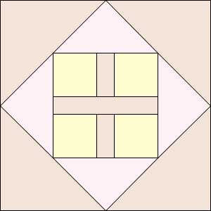
Varvara Stepanova
1924
Moscow

Varvara Stepanova
1894-1958


Stepanova, born in Lithuania, was associated with the Soviet Constructionists. In the decade after the Russian Revolution, political theory demanded functional textiles and modernism demanded basic geometric elements and limited colors.


Here's an essay at the Tate Museum site about the First State Textile Factory and her associate there, Liubov Popova.

Artist David Mabb has been combining some Russian Constructivist prints with William Morris prints, obtaining strange results.

Thursday, July 25, 2013

Minimalism: Bauhaus Textiles

Woven Rug by Gunta Stölzl, 1922
Collection of the Museum of Modern Art.

1927
Gunta Stölzl was chair of the weaving department at 
Germany's Bauhaus art school.

Anni Albers (lower right) recalled the early days at the art school : "There was no real teacher in textiles. We had no formal classes. Now people say to me: 'You learned it all at the Bauhaus'! We did not learn a thing in the beginning. I learned from Gunta, who was a great teacher. We sat down and tried to do it. Sometimes we sat together and tried to solve problems of construction."

Gunta Stölzl
Sketch for a rug design 1926

Gunta Stölzl in her apartment, 1927

Within the Bauhaus emphasis on primary shapes Stölzl and her students worked out variations on the limited theme.


Gunta Stölzl
Sketch for a rug design

Women students were confined to the weaving department at the school, which was not modern in its view of womens' roles.

They also served as models for Bauhaus photographers exploring the square, rectangle, triangle and circle.


László Moholy-Nagy 

The Olly and Dolly Sisters


Weaving sketch by Lena Bergner

Rug by Margaretha Reichardt, 1978

The Bauhaus weavers carried the theme with them after the school closed in the early 1930s due to Nazi harrassment. Stolzl moved to Switzerland.

Anni Albers in the 1920s

Albers and her husband Josef moved the the United States where they first taught at the Black Mountain School.

Weaving by Anni Albers


Weaving "With Verticals"
By Anni Albers, 1947

Bauhaus Textiles: Women Artists and the 
Weaving Workshop by Sigrid Wortmann Weltge

Too bad we didn't buy this book when it was new. It's expensive now but see if you can find it at your library or through interlibrary loan.

See more of Stolzl's and Albers's work at websites devoted to them.
http://www.guntastolzl.org/
http://www.albersfoundation.org/Home.php

See another photo of the women in the weaving department here:
http://www.guntastolzl.org/Works/Bauhaus-Dessau-1925-1931/On-the-Bauhaus-Staircase/1462128_JfVLRW#!i=74319744&k=zc8tqGj

Read about the school at the Metropolitan Museum of Art's webpage:
http://www.metmuseum.org/toah/hd/bauh/hd_bauh.htm

And here's a post I did last year on Stolzl:
http://barbarabrackman.blogspot.com/2012/04/gunta-stolzl-bauhaus-master.html

Monday, July 22, 2013

Modern Print Monday: William Morris


Strawberry Thief by William Morris, 1883
England
The original was a woven tapestry.


William Morris
1834-1896

It's hard to see principles of modernism in this complex design, here in printed cotton for my Moda collection A Morris Tapestry. Morris certainly ignored the idea of minimalism in his many layers of pattern. His abstractions seem not too abstract to us, rendered in detail. He used shading to give the illusion of depth.

Yet, many art historians consider Morris's 1860's work as the advent of design's modern era. He began with ideas of abstraction and flat color that others continued to push over the next fifty years. He deliberately set out to flatten design, to reduce the three-dimensional illusion that was the standard for mid-Victorian wallpaper and furniture. 


He also changed the scale. Here a reproduction print on a contemporary piece of furniture shows the relative size of many of his prints.

Morris was a forerunner of modernism in many ways, but he was also the antithesis of modernism---a revival artist. His pattern and techniques looked back to medieval tapestry design. His colors were derived from natural dyes like indigo and madder, rather than the new technology of his own era. He believed in the hand made and the crafts workshop rather than the factory and industrial production.

Modern/Not Modern.

See some Morris modernized by Emilia Haglund for a design project here:

Thursday, July 18, 2013

Modern Pattern: Vienna Lily

Vienna Lily Triptych top
Barbara Brackman

This pieced triptych (3 panel) wallhanging fits in with the current theme of minimalism, as it uses a few basic shapes to represent a floral---perhaps an Asian lily.
You can make it as one panel or three. Below is a free pattern (remember you get what you pay for!)

Vienna Lily Tryptich
35" x 35"

I just hand quilted this. The top is probably ten years old, made so long ago that I didn't have any William Morris repros to work with. The flowers are batiks and the leaves shades of sage green prints. It's been so long that Pam Mayfield and I can't remember who pieced it. I think she did but I guess I'm taking the credit.

Trademark of the Viennese Workshop
The Wiener Werkstätte

My inspiration was the trademark above and the lilies in my garden (they have to grow in pots because voles snack on them.)

A single panel finishes to 10" x 35".

The shade garden


The flower finishes to 10" square


Cutting Instructions for 1 Floral

A - Cut 2 squares 5 7-8".

Cut each in half diagonally to make 2 triangles. You need 4 triangles.

B - Cut 1 square 6-1/4".

Cut with 2 diagonal cuts to make 4 triangles. 

C - Cut 1 rectangle 1-3/8" x 5-1/2"

D - Cut 4 squares 2-5/8"

E - Cut 2 rectangles 2-5/8" x 1-3/8"


Cutting Instructions for 1 Leaf panel

F - Cut 1 dark & 1 medium rectangle 6" x 4-3/4". Cut from corner to corner diagonally in different directions. You need 4 triangles.


Here's why I think Pam pieced this.
I had a lot of trouble getting the triangles to go the right way.
I have no advice.
Calling her won't do any good. 

G - The leaf G is a strangely proportioned parallelogram--- a rhomboid, I believe.
Cut 5 dark and 5 medium rectangles 8-3/4" x 3-5/8". Cut using the template below. 
But flip the template over so you get the left and the right side of each stem. You need:
Left Side: 3 dark, 2 medium
Right Side: 3 light, 2 medium

To print the template, click on the above picture and save it as a JPG or in a word file.
Print it out so the long side measures 7" with seams.

Or here's a PDF in Adobe Workspaces


Cutting the strips between the 3 lilies (H) for a tryptich
H -Cut 2 strips 35-1/2" long by 3" wide.

For the triptych alternate lilies and plain strips H.


Monday, July 15, 2013

Modern Print Monday: Elsie de Wolfe

A fake leopard print

Elsie de Wolfe
(1865-1950)
About 1920

The origins of false leopard prints, like zebra prints, are impossible to pinpoint, but we can credit the designer who popularized them. The design history consensus is that Elsie de Wolfe, interior designer in the early 20th century, made the idea of imitation leopard prints an avant-garde necessity. 

De Wolfe's Villa Trianon has leopard pillows in a romantic interior.

De Wolfe gets a lot of credit for many ideas. She is sometimes called the first interior designer, but that's probably a name she gave herself. Before she was a designer she was an actress and she knew something about publicity. In the 1920s she began tossing fur-covered pillows and footstools into her interiors, but when actual furs proved expensive she commissioned printed copies.

Ava Gardner in a leopard print bathing suit, 
about 1950.

Leopard prints---wild cat prints---came to symbolize a certain animal-like sexuality

Which is why they serve the uses of irony so well.
Did Elsie de Wolfe invent them?

Here's Welsh patchwork from 1830 with a faux-leopard print in the corners.
See the whole piece at the Victoria and Albert Museum:
http://collections.vam.ac.uk/item/O136397/bed-cover-unknown/


And click here and scroll down to see a page from an English sample book, about 1775, in the collection of the American Textile History Museum:
http://www.athm.org/collections/osborne_library/

Gotta Have It!
An ad from Sears.

Thursday, July 11, 2013

Minimalism: Ornament as Crime


Wool Print by Sonia DeLaunay
1977

The trend advocating minimal ornament such as circles and squares was pushed even further by architects advocating Minimalism as a philosophy as well as a design principle.
In 1908 Adolf Loos published a diatribe called Ornament and Crime.

Loos's tombstone. 
His dates (missing due to the idea that they are unnecessary ornament, I guess) are
1870-1933

He despised any decorative detail and likened ornament to disease and degeneration, among other negative images, as well as "unmodernism," which caused "enormous damage and devastation ...in aesthetic development."

You can read Loos's essay here at the George Washington University Website

Loos's ideas influenced Germany's Bauhaus School theories on architecture and design, trends that became known as International Style. When Hitler came to power in 1933 many Bauhaus faculty and former Loos students fled to the U.S. Several became influential teachers at American schools, creating a generation of designers who agreed with Loos (although the rhetoric was toned down.) 

Bauhaus glass box

Bauhaus minimalism was not the first imported wave of modernism, but because we imported the designers themselves, their principles strongly affected our architecture and interiors. 

Miller House by Richard Neutra, a pupil of Loos, 
Palm Springs.

Within 20 years of their arrival the ideal building was an unadorned box....
Furnished with chairs of pared-down line
upholstered in fabrics of the most minimal design.

Chair by Charles Eames and Eero Saarinen
1941


Textured cloth was acceptable ornament.

You can still buy a Saarinen Womb Chair
in any of dozens of minimal textured fabrics.
No prints.

This contemporary grass cloth is probably too busy.

Pattern designers would be out of business if everyone listened to Loos..

But people love pattern---so prints were designed as a response to the
trend for texture.

Fake textures


These are feedsack prints,
terribly up-to-date
in the era of International Style.


Here's a textured seersucker with added printed texture.


But don't tell Adolf Loos. He would come unglued.

Although he MIGHT approve of quilting as texture.


Very modern. Very International Style.
"New York" quilt from Haptic Lab.

Quilting from Canoe Ridge Creations

The quilted wholecloth quilt, as in this example
from Crate & Barrel, may be the essence of minimalism.


See another post about Loos here:
http://barbarabrackman.blogspot.com/2010/09/modernism-and-ornament.html